The approved identity
A2 Architectural Threshold, from TTE Masterbrand Production Suite v1.0. Deep Slate one-colour mark. Ember is a controlled supporting accent only, capped at five per cent of a composition, and never colours a plane in the core symbol.
The three exploratory directions previously shown here have been withdrawn. Everything below is generated from the supplied files, and npm run check:brand fails the build if the site's copy of the geometry or the palette drifts from them.
The symbol at size
Digital minimum is , print minimum . The component clamps to the digital minimum, so a mark cannot be set below it by accident.
On ground
The symbol inherits currentColor in every case, so there is one definition rather than a file per ground.
Lockups
The header and footer inline the compact cut and recolour it tocurrentColor, so one asset is correct on any ground and in both colour schemes. The full cuts, including the tagline lockups, are in the vector set below.
Palette
#303847#4B576E#E46F3C#A94722#F6F5F2#171D24Plain ember measures 2.90:1 on the warm surface, so it is never used for text. The accessible cut is used instead, and every guaranteed pairing is measured inthe contrast evidence.
Misuse
- Do not recolour a plane of the symbol. It is a one-colour mark and ember must never fill a plane.
- Do not add a containing circle, box, outline or drop shadow.
- Do not close, narrow or widen the gap between the planes. The gap is the threshold.
- Do not rotate, stretch, skew or redraw the symbol.
- Do not set any lockup below its minimum size.
- Do not rebuild the wordmark in another typeface. Use the supplied vector.
- Do not place the primary lockup on a busy photograph. Use the reversed cut.
- Do not use the tagline as a substitute for the mark.
The Edge family
The supplied README states that the family lockups are not yet drawn, because the organisation names and descriptors were not supplied with the brief given to the brand designer. They are confirmed below, so the lockups can be generated from them.
- The Transformation EdgeChurchmasterbrand, supplied
- Edge Community Care Services LtdCommunity carelockup to be generated. Separate legal entity, DGR-endorsed.
- EdgedIn NetworkMedia and publishinglockup to be generated
Nothing on this site renders a family mark until those lockups exist. An approximated ECCS mark would be worse than none: ECCS is a separate legal entity and its identity is not ours to improvise.
The asset set
- Masterbrand guidelines, PDF
- Brand tokens, JSON
- Horizontal, primary
- Horizontal, reversed
- Horizontal, mono
- Horizontal, compact
- Stacked, primary
- Stacked, reversed
- Symbol, primary
- Symbol, reversed
- App icon
- Social avatar




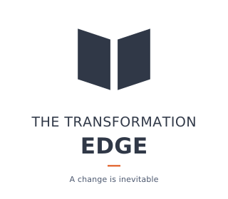
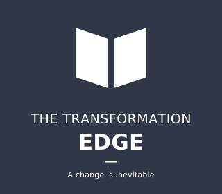




Each vector also ships as PDF and EPS in public/brand/vector/. The wordmark is outlined, so the files are portable with no font to supply.
One thing to confirm
The supplied lockup artwork sets the tagline as A change is inevitable. The locked wording in section 2 of the brief is A change is inevitable, in title case. The site uses the locked wording wherever the tagline is set as text. The artwork has not been altered, because it is a supplied master. Worth confirming which is intended before the lockups go to print.